Contents
- These Fonts Actually Make Your Brand Look Professional
- 1. Saveur Sans - The High-Fashion Choice (Affiliate)
- 2. Pontiac - Geometric Without the Ego (Affiliate)
- 3. Raleway - The Startup Favorite (Free)
- 4. Munich - When You Need to Command Attention (Affiliate)
- 5. Montserrat - Urban Inspired, Universally Useful (Free)
- 6. Gotham Book — The Modern American Classic (Affiliate)
- 7. Quicksand - The Approachable Alternative (Free)
- 8. Sofia Pro - The Reliable Professional (Affiliate)
- 9. Amoret - Understated Luxury (Affiliate)
- 10. Work Sans — The Designer's Workhorse (Free)
- Making These Fonts Work in Real Projects
- Three Mistakes That Kill Good Typography
- So where can we go with this?
These Fonts Actually Make Your Brand Look Professional
Most sans serif font lists throw everything at the wall and hope something sticks. This one's different. These ten typefaces have proven themselves in real projects-from startup logos that landed Series A funding to packaging designs that moved product off shelves.
I've mixed premium fonts worth the investment with solid free options from Google Fonts. Each comes with specific use cases and one practical tip you can apply today.
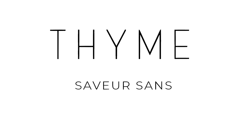
1. Saveur Sans - The High-Fashion Choice (Affiliate)
Those narrow letterforms aren't just stylish-they're strategic. Saveur Sans compresses beautifully for packaging while maintaining elegance at large sizes.
Best for: Boutique brands, editorial headers
Tip: Set in all caps with 200-300 tracking for luxury packaging labels
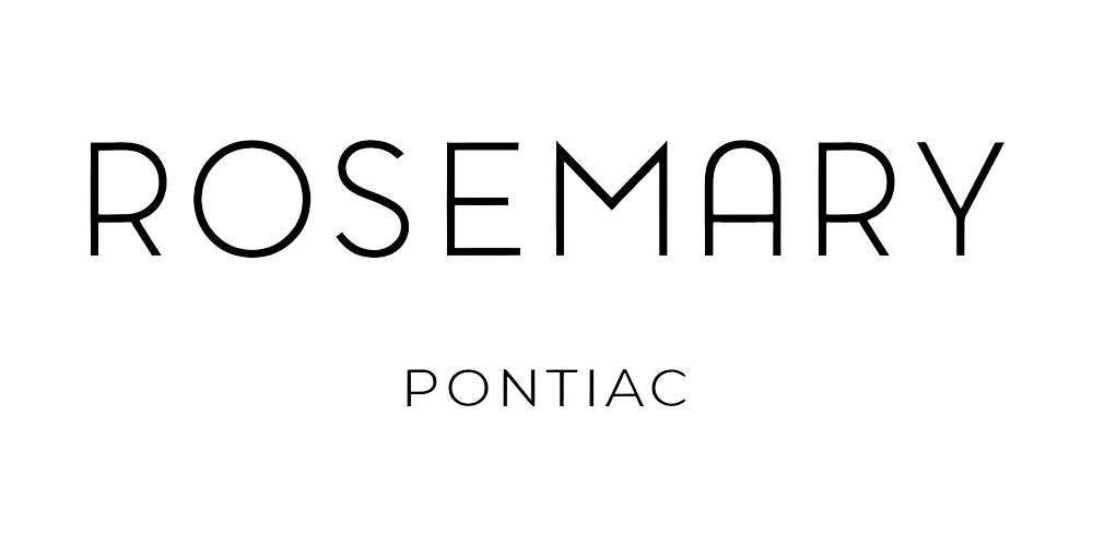
2. Pontiac - Geometric Without the Ego (Affiliate)
Rounded corners keep this geometric sans from feeling cold. The subtle curves make it accessible while maintaining serious design credibility.
Best for: Wellness brands, modern portfolios, lifestyle products
Tip: Mix with a traditional serif for logos that feel both fresh and established
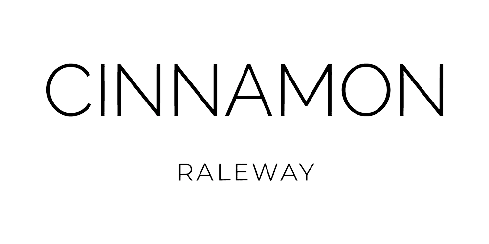
3. Raleway - The Startup Favorite (Free)
Eighteen weights make this Google Font a complete branding toolkit. It's been battle-tested by thousands of companies for good reason.
Best for: Web interfaces, minimal branding, content-heavy sites
Tip: Use Raleway Light for body copy and Bold for headlines-instant hierarchy
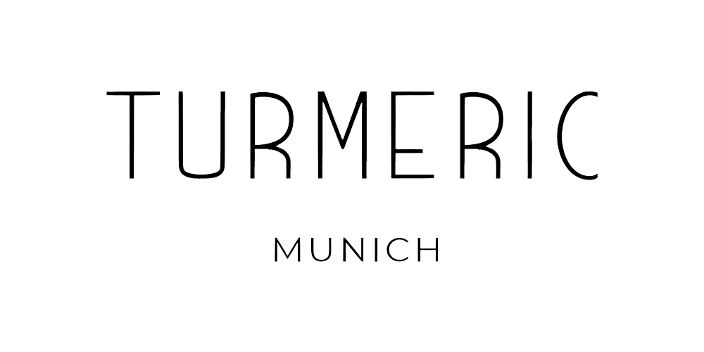
4. Munich - When You Need to Command Attention (Affiliate)
Sharp, architectural letterforms that photograph well and scale beautifully. This isn't a wallflower font-it's built for making statements.
Best for: Fashion brands, bold packaging, statement headlines
Tip: Use sparingly as a display font; let it own the space without competition
5. Montserrat - Urban Inspired, Universally Useful (Free)
Born from Buenos Aires street signage, refined for global brands. This free font handles everything from app interfaces to annual reports.
Best for: Tech companies, digital products, editorial projects
Tip: Bump line height to 1.6 for better digital readability
6. Gotham Book — The Modern American Classic (Affiliate)
Clean, authoritative letterforms that helped define contemporary branding. This geometric sans carries serious design pedigree without feeling dated.
Best for:Corporate identity, editorial design, museum branding
Tip: Mix Gotham Book with Gotham Bold for headlines that command respect
7. Quicksand - The Approachable Alternative (Free)
Soft, rounded letterforms that feel human without sacrificing legibility. Perfect when your brand needs to feel accessible.
Best for: Education, family brands, casual lifestyle products
Tip: Stick to Regular and Medium weights; the extremes can look gimmicky
8. Sofia Pro - The Reliable Professional (Affiliate)
This geometric sans has earned its reputation in corporate boardrooms and design studios alike. Nine weights give you flexibility most fonts can't match.
Best for: Corporate identity, SaaS products, professional services
Tip: Build your entire brand system using different weights from the same family
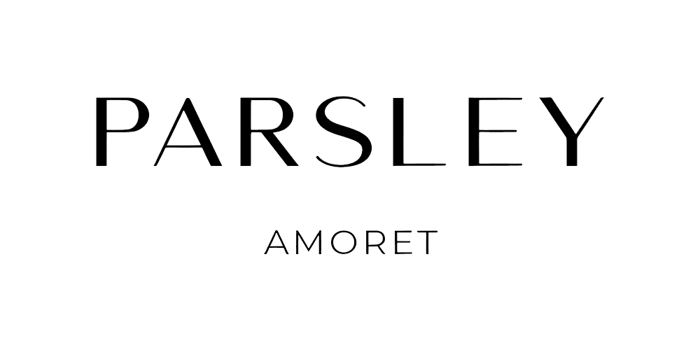
9. Amoret - Understated Luxury (Affiliate)
Delicate without being fragile. This minimal sans serif brings sophistication to brands that need to whisper confidence rather than shout it.
Best for: Beauty brands, minimal packaging, high-end services
Tip:Increase letter spacing and pair with soft color palettes
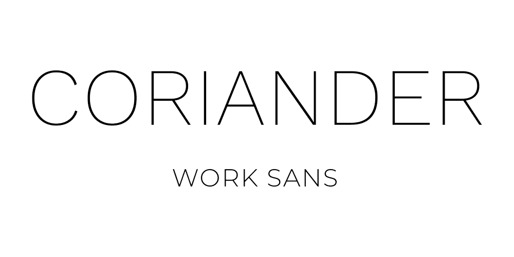
10. Work Sans — The Designer's Workhorse (Free)
Optimized for screen use but equally strong in print. This Google Font was built specifically for digital interfaces, making it a reliable choice for web-heavy brands.
Best for:Tech startups, digital agencies, app interfaces
Tip:Use medium weight for UI elements and regular for body text—perfect screen legibility
Making These Fonts Work in Real Projects
Create hierarchy through weight, not size. Use your sans serif family's bold and light weights to guide the eye rather than making headlines massive.
Pair strategically. A geometric sans serif with a traditional serif creates tension that makes both fonts more interesting.
Give your type room to breathe. Sans serifs need white space to show off their clean lines; cramped layouts kill their effectiveness.
Three Mistakes That Kill Good Typography
- Using ultra-thin weights for body text. Save the delicate weights for headlines and short phrases.
- Pairing fonts that are too similar. If you can't immediately spot the difference, choose something with more contrast.
- Relying on one weight for everything. Even the best sans serif gets boring when it's the only voice in your design.
So where can we go with this?
Sans serif fonts earn their place in modern branding by being both timeless and adaptable. Whether you invest in a premium family like Sofia Pro or build your brand around free powerhouses like Montserrat, these fonts will anchor your visual identity with clarity and confidence.
The key isn't finding the perfect font; it’s using the right font well.


Thank ou for sharing
Hello. How do I download Oregano?