Contents
- Clean lines. Sophisticated vibes. Fonts that actually work.
- 1. Forum — The Editorial Aristocrat (Affiliate)
- 2. Raleway — The Minimalist Workhorse (Free)
- 3. Muse — The Understated Romantic (Affiliate)
- 4. Sulfur Point — The Geometric Precision Tool (Free)
- 5. Black Mango — The Minimal Maverick (Affiliate)
- 6. Ysabeau Infant — The Refined Modern (Free)
- 7. Classico — The Timeless Authority (Affiliate)
- 8. Thasadith — The Light & Airy Champion (Free)
- 9. Sundays — The Casual Sophisticate (Affiliate)
- 10. Brown Austin Sans — The Modern Foundation (Affiliate)
- How to Use Minimalist Fonts Like a Pro:
- Common Mistakes to Avoid:
- One last thing:
Clean lines. Sophisticated vibes. Fonts that actually work.
Whether you're building a luxury brand, launching a sleek website, or creating wedding invites that don't look like every Canva template out there, the right minimalist font can make or break your project.
This list blends premium fonts worth investing in with free Google Fonts you can use right now. Each pick includes what it's best for, why it works, and a quick pro tip to help you get instant results.
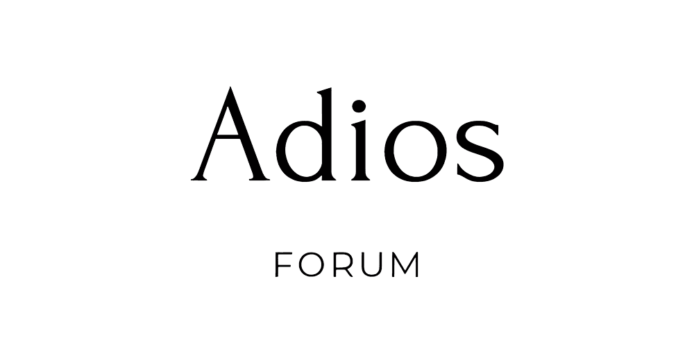
1. Forum — The Editorial Aristocrat (Affiliate)
Classic serif elegance with tall, refined proportions that make everything look expensive.
Best for: Luxury branding, fashion websites, high-end editorial design.
Tip: Pair with Raleway Regular for subheadings and increase letter spacing slightly for a premium look.
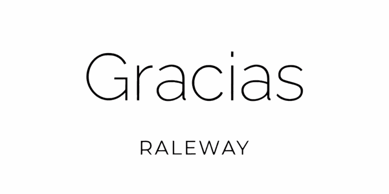
2. Raleway — The Minimalist Workhorse (Free)
The most versatile minimalist sans-serif with 18 different weights for any design need.
Best for: Websites, resumes, product packaging, all-purpose branding.
Tip: Use in all caps with wide tracking for instant label-ready sophistication.
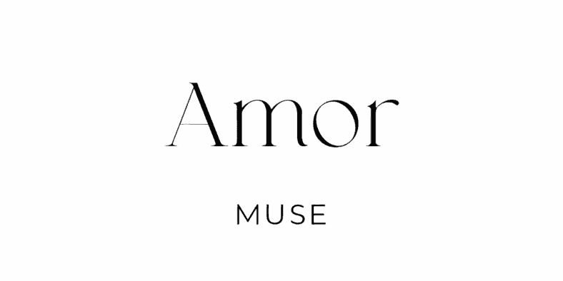
3. Muse — The Understated Romantic (Affiliate)
A minimal serif with a whisper of romance — graceful without being precious.
Best for: Luxury cosmetics, book covers, boutique branding.
Tip: Combine with a light sans-serif for balance and warmth.
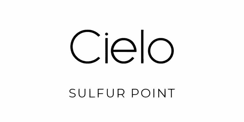
4. Sulfur Point — The Geometric Precision Tool (Free)
Clean geometric sans-serif with subtle optical tweaks to keep it approachable.
Best for: Modern tech brands, social media templates, startup identities.
Tip: Pair with a refined serif like Forum for brand systems that feel innovative but trustworthy.
💡 Quick Tip
Pairing a free Google Font with a premium font can give clients a luxury look while keeping costs manageable. Example: Sulfur Point (free) + Muse (paid) = polished tech startup branding.
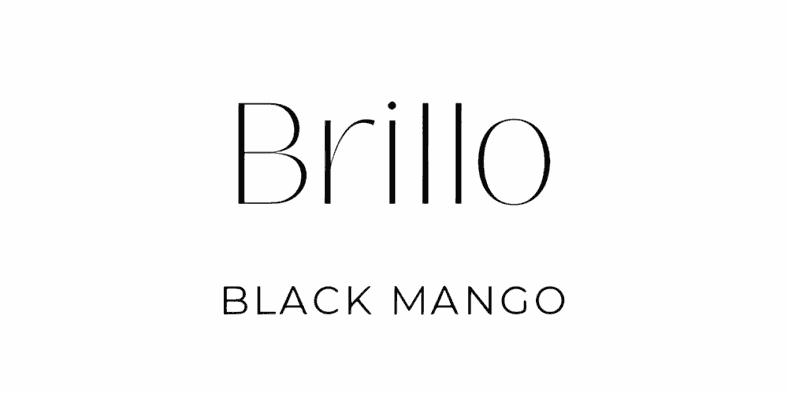
5. Black Mango — The Minimal Maverick (Affiliate)
Display serif with subtle curves that add personality without breaking minimalism.
Best for: Boutique logos, wedding stationery, premium packaging.
Tip: Looks incredible in monochrome applications where form is everything.
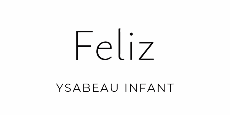
6. Ysabeau Infant — The Refined Modern (Free)
A contemporary serif balancing soft curves and sharp elegance.
Best for: Editorial spreads, minimalist brand kits, luxury packaging.
Tip: Pair with Sulfur Point or Raleway for a timeless serif-sans duo.
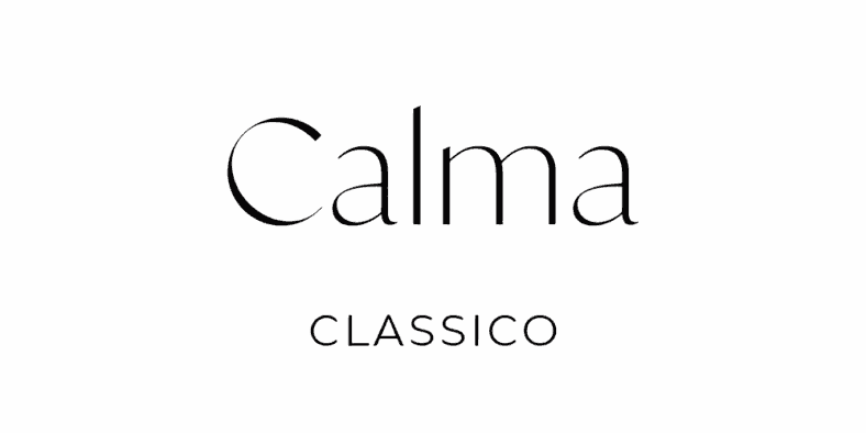
7. Classico — The Timeless Authority (Affiliate)
Serif sophistication with classic proportions and subtle modern refinements.
Best for: Law firms, high-end consultants, formal invitations.
Tip: Combine with a geometric sans for instant credibility and balance.
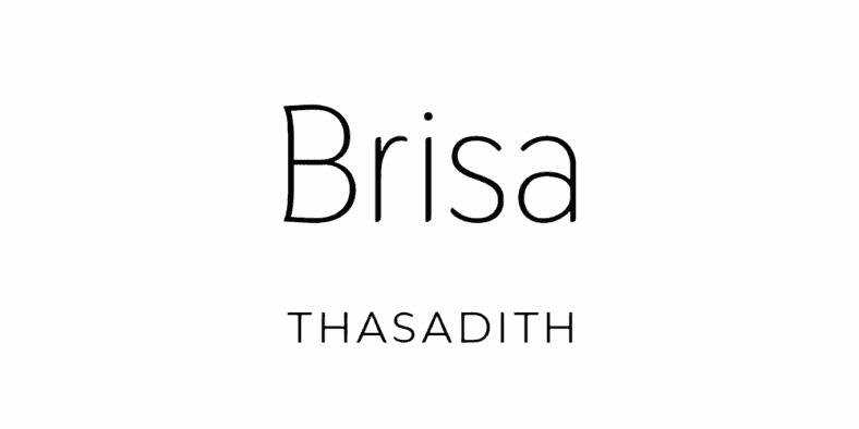
8. Thasadith — The Light & Airy Champion (Free)
A sans-serif designed for generous white space and readability.
Best for: Blog headings, product descriptions, minimalist websites.
Tip: Increase line height for even more breathing room in layouts.
💡 Quick Tip
Google Fonts like Thasadith are perfect for body text — keep the headers in a premium font for contrast and perceived value.
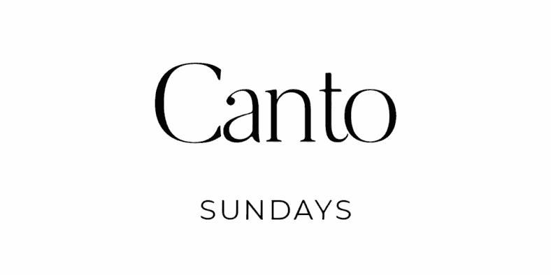
9. Sundays — The Casual Sophisticate (Affiliate)
Elegant serif that feels approachable and refined — like a crisp linen shirt with a glass of wine.
Best for: Lifestyle brands, fashion e-commerce, influencer kits.
Tip: Works beautifully in lifestyle photography and social graphics.
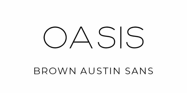
10. Brown Austin Sans — The Modern Foundation (Affiliate)
A clean, versatile sans-serif that pairs with almost anything.
Best for: Website headers, signage, modern brand systems.
Tip: Pair with Sundays or Classico for a high-contrast, minimal branding combo.
How to Use Minimalist Fonts Like a Pro:
- Limit to 2 fonts: One serif + one sans-serif keeps things clean.
- Let white space work: Minimalism needs breathing room to shine.
- Build hierarchy with size and weight: Avoid unnecessary decoration.
Common Mistakes to Avoid:
- Using ultra-thin weights for small text.
- Overcomplicating with 3+ font families.
- Ignoring how fonts look on mobile screens.
One last thing:
Minimalist fonts don't just look good; they build trust, clarity, and timeless appeal. Whether you stick with free Google Fonts or invest in a few premium picks, the key is pairing wisely and giving your typography space to breathe.


0 Comments